

Roald Dahl Book Cover Series

Roald Dahl Book Series
Instructor: Keith Sommers
Introduction:
This book cover series are illustrations of the three beloved classics “Fantastic Mr. Fox”,” James and the Giant Peach” and “The BFG.” that I brought to life. What sets this project apart is the seamless integration of the covers, creating an interesting visual experience. Each cover was meticulously crafted to capture the essence of its respective story while harmonizing with the others.


“Fantastic Mr. Fox” gives off mischievous charm evoking the spirit of adventure and cunning wit.


“James and the Giant Peach” transports readers to a whimsical realm with its dreamlike imagery and intricate details hinting at a magical journey within.

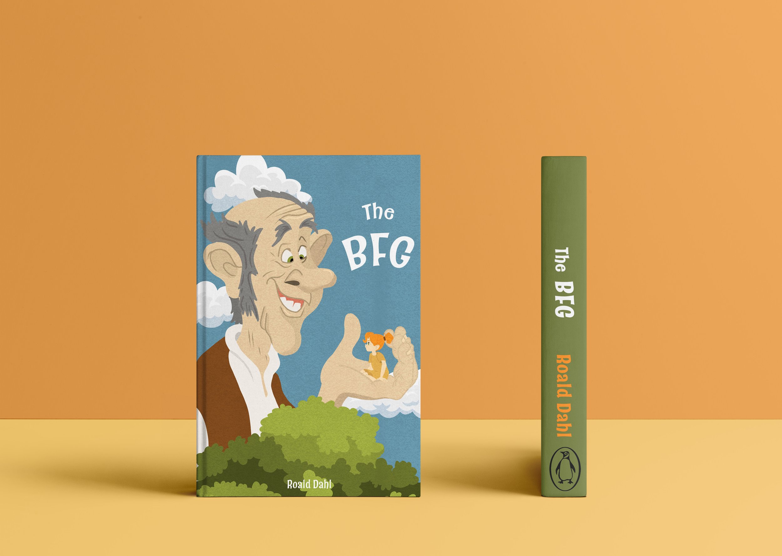
Lastly, “The BFG” invites viewers into a world of imagination and wonder, with its larger-than-life characters and fantastical landscapes.

The true magic lies in how these covers seamlessly align when placed above each other. Through clever design choices and careful consideration of layout and composition, I created a unified visual narrative by also using the same color palette and font. In doing so I am inviting the readers to explore the interconnected themes of motifs woven throughout Dahl's timeless tales.

To the Lighthouse Book Jacket
Book Jacket
Instructor: Jen Stern
Introduction:
This was a Typography based project where I chose "To the Lighthouse" by Virginia Woolf to create a cover for. The cover I designed is a harmonious blend of artistic imagination and thematic representation. Capturing the essence of Woolf’s seminal work, the cover art seamlessly integrates typography with visual story telling.

In the cover I illustrated a man rowing a boat towards the distant lighthouse that I chose not to depict. As the boat glides across the sea, its rhythmic motion creates gentle ripples that go across the water's surface. These ripples serve as the canvas for the title that is intricately woven into the ripple patterns of the waves. I tried to make the letters appear as if they are a part of the natural flow of the water.The choice of adding the title within the water adds a playful and dynamic element to the cover but also symbolizes the journey embarked upon by the characters in the novel.

The color palette I chose is subtle yet evocative, with hues of blues and yellow as a pop of color dominating the scene, echoing the ethereal atmosphere of the novel's coastal setting. The interplay of light and shadow further enhances the mood casting a sense of mystery and introspection over the entire composition.
