
Thesis: Lily the Artist
Lily the Artist:
Art Direction: Jason Kernevich
Introduction:
“Lily the Artist” is a personal story about my journey of adoption and my development as an artist, emphasizing that family isn’t solely based on blood. The project aims to create a visually engaging and emotionally resonant scrapbook-style narrative. I collaborated closely with my professor Jason Kernevich and my aunt. As the art director I overlooked the creative direction and execution part of the project.
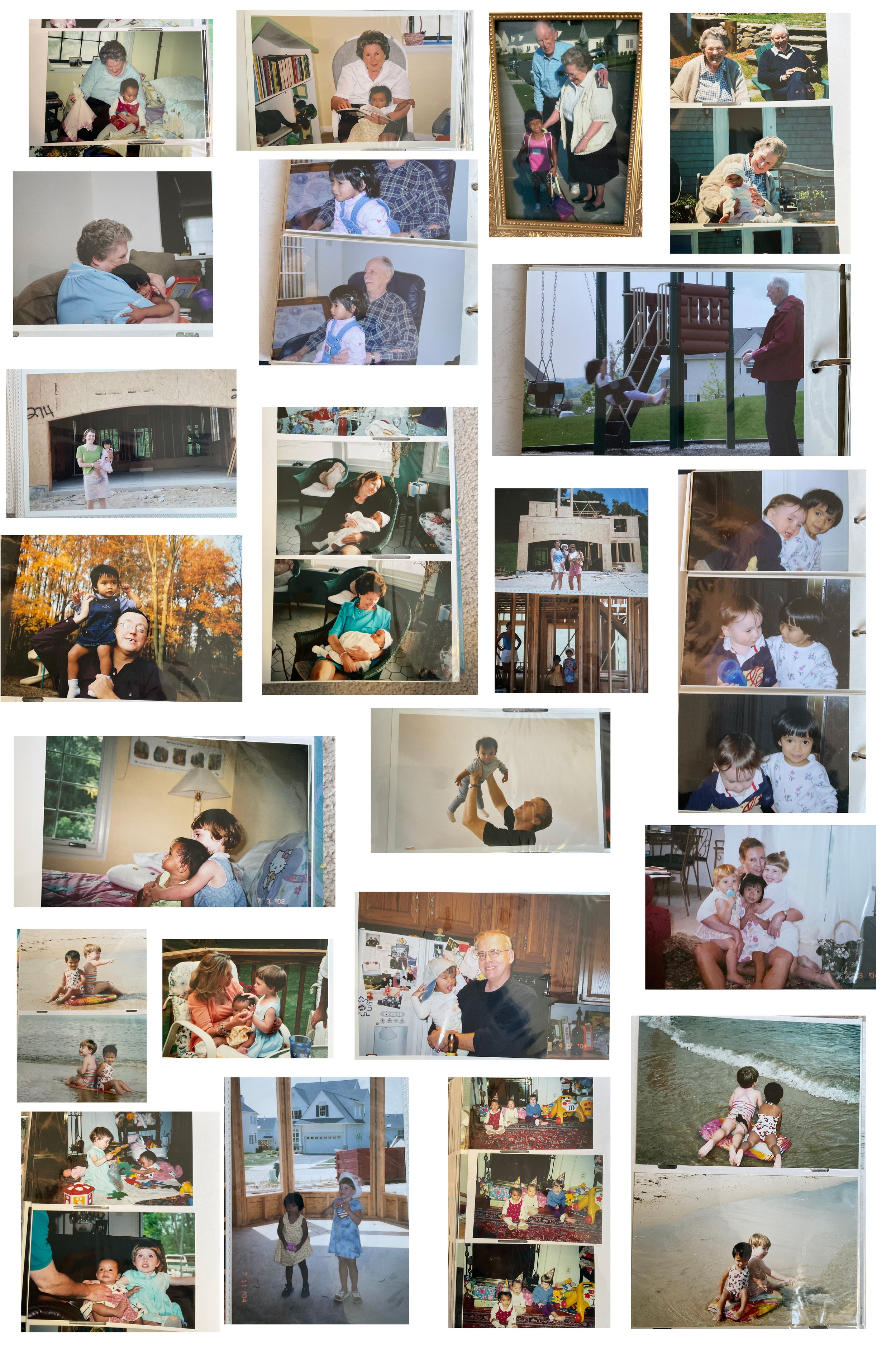
I began my book with introspection by reflecting on my journey from adoption and becoming an artist. I then dug out my old adoption books and looked through them. I took notes of features that I liked and didn't like that I could use in my book.


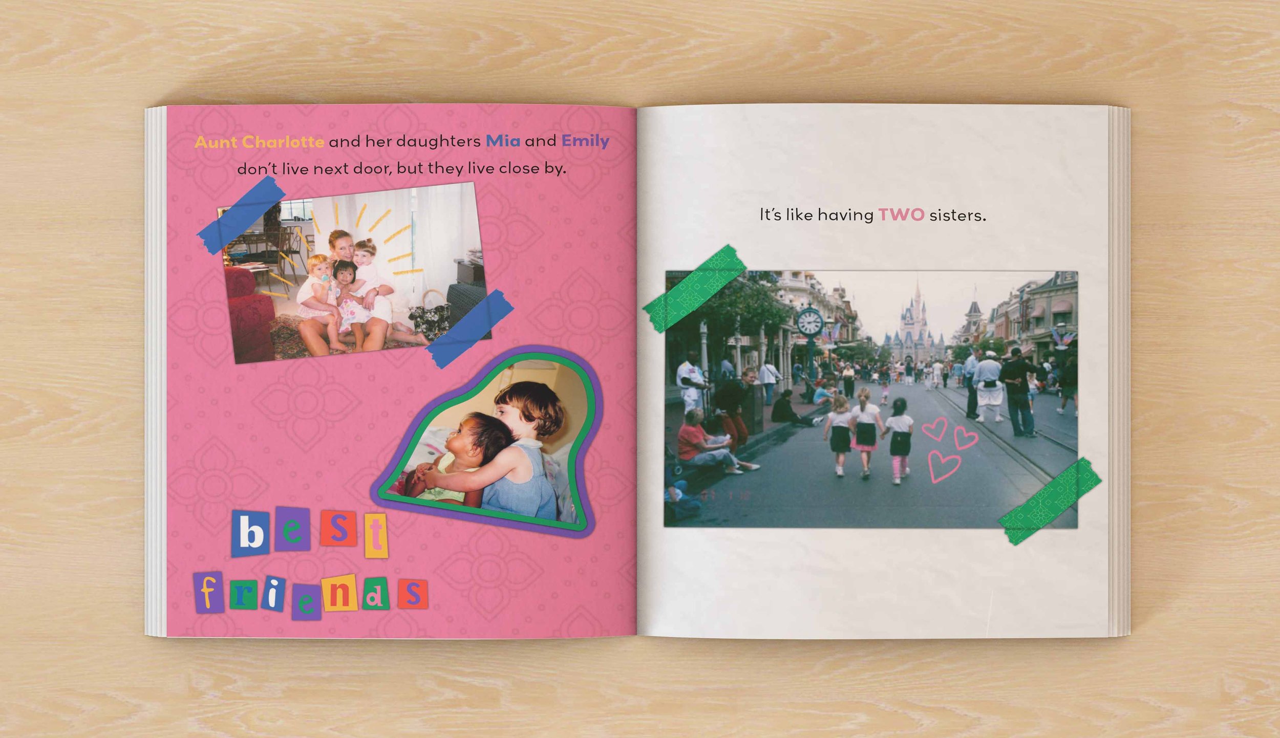
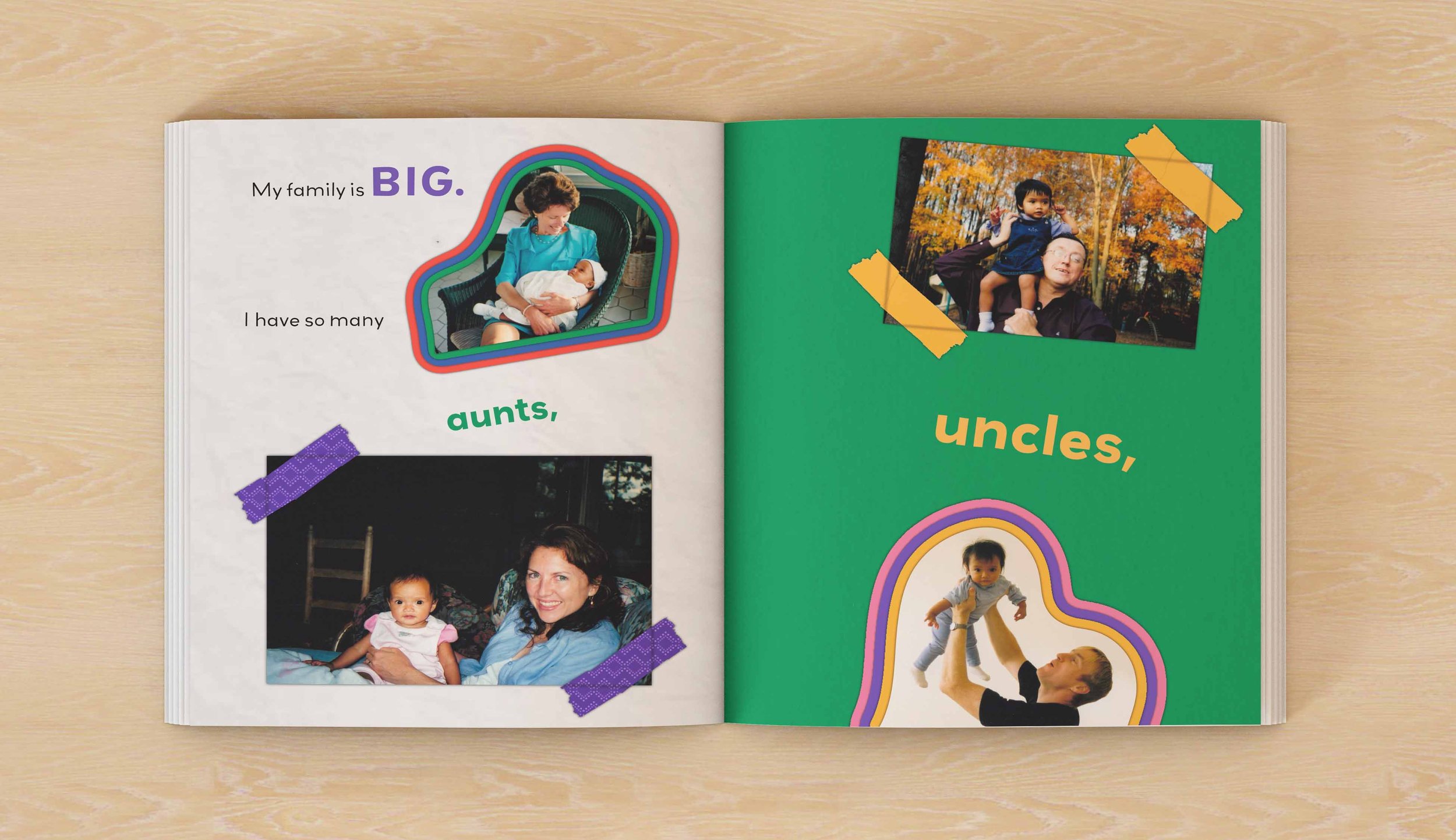
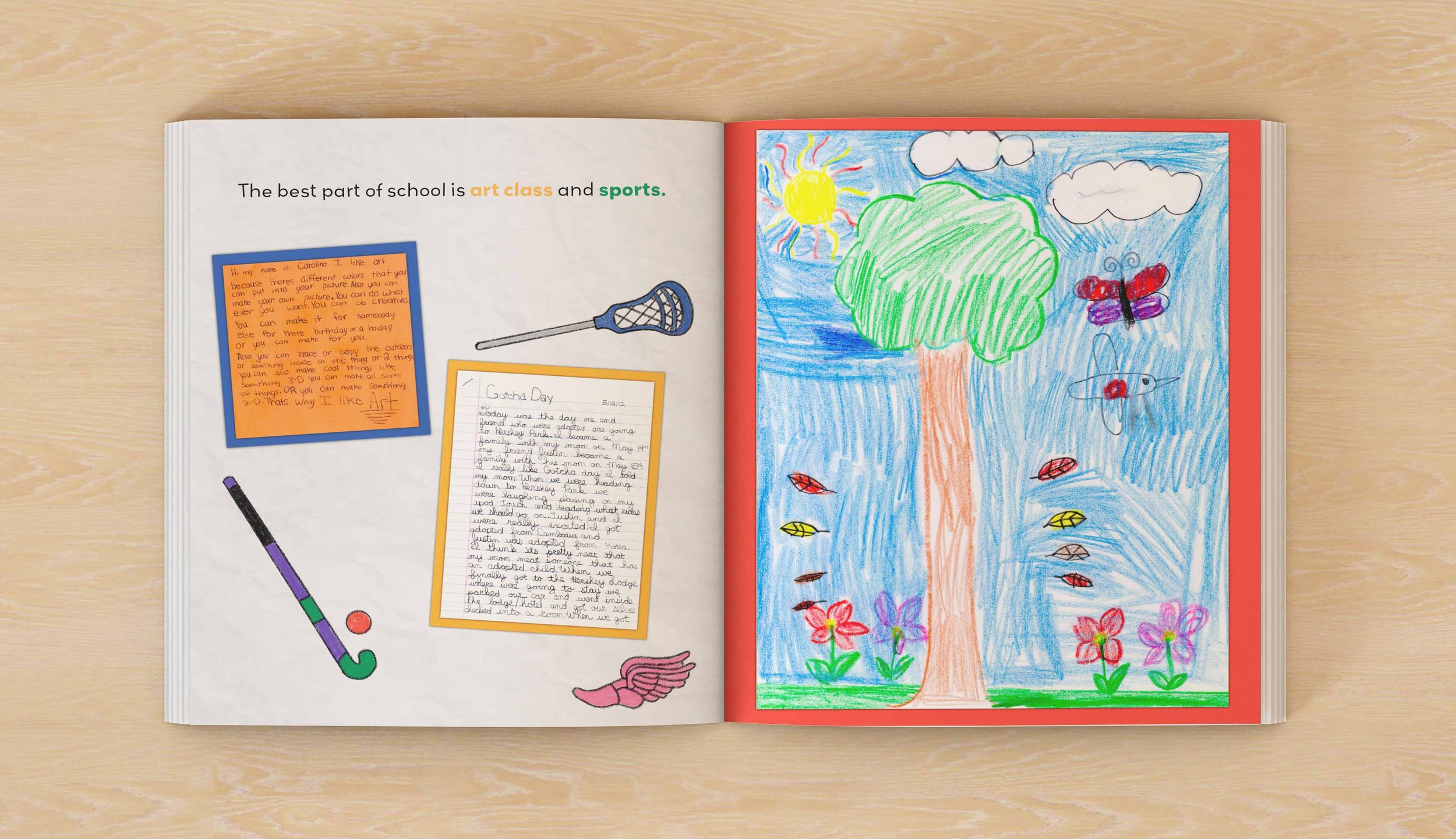
My primary goal was to create a book that not only shared my unique story but also resonated with readers who have experienced adoption or explored adoption. I wanted to create a compelling narrative that blends personal experiences with artistic expression, so I chose a scrapbook theme to convey a sense of intimacy and personal reflection.


I began my book with introspection by reflecting on my journey from adoption and becoming an artist. I then dug out my old adoption books and looked through them. I took notes of features that I liked and didn't like that I could use in my book.
I then turned to Pinterest to look for how I could approach the book artistically. I formed a couple ideas, one being that I would illustrate each photo that I wanted to use, another idea being that I would start from scratch and create images from my memory and imagination. The final idea that I chose to go with was making the book scrapbook like to not only touch on the personal side of my story but the design and illustration side of my life.
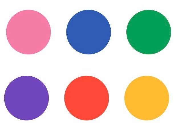
For this idea I went back to Pinterest and looked up ideas of scrapbook layouts and created a mood board. One image caught my eye because of the use of bold colors. I decided to use that image as a reference for my book and how I wanted to design it.

After finding a few ideas I started designing. I chose the first page to experiment with and created a bunch of different layouts. This helped me because I could use this as a reference to reflect onto the other page.
Once I got a layout that I was happy with I moved on to the next page.
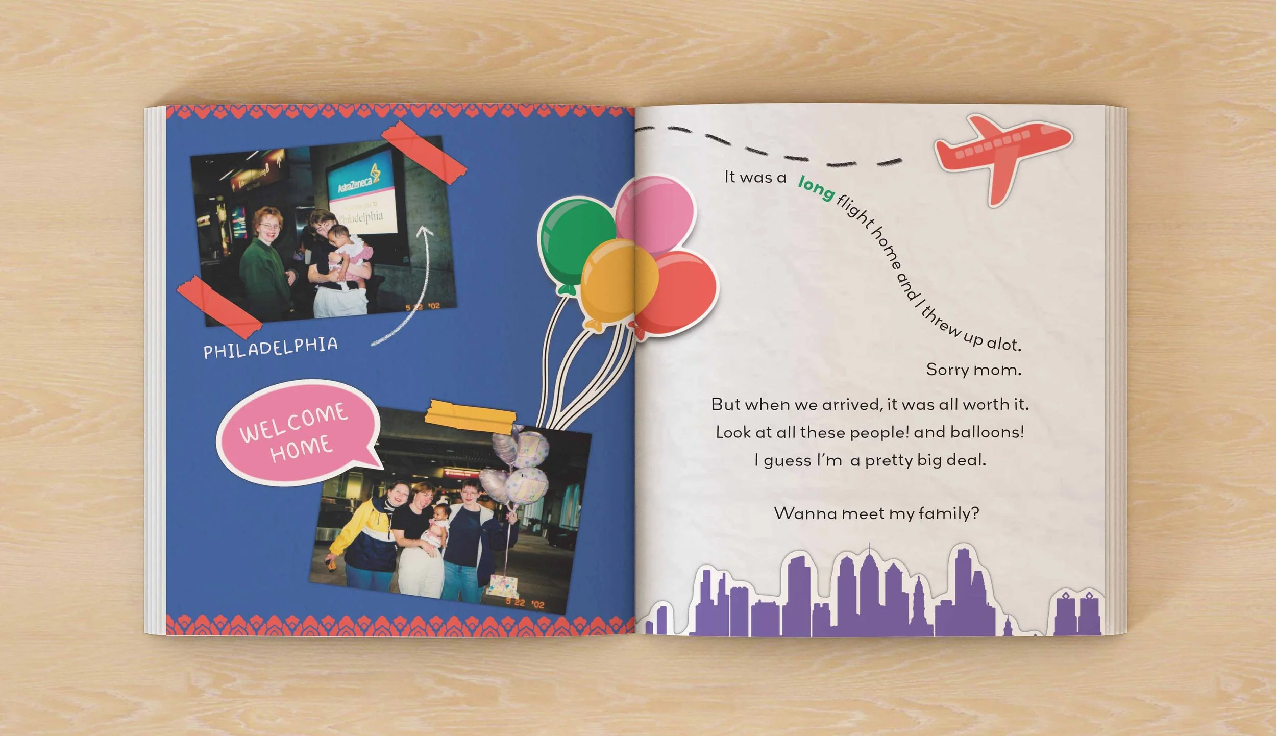
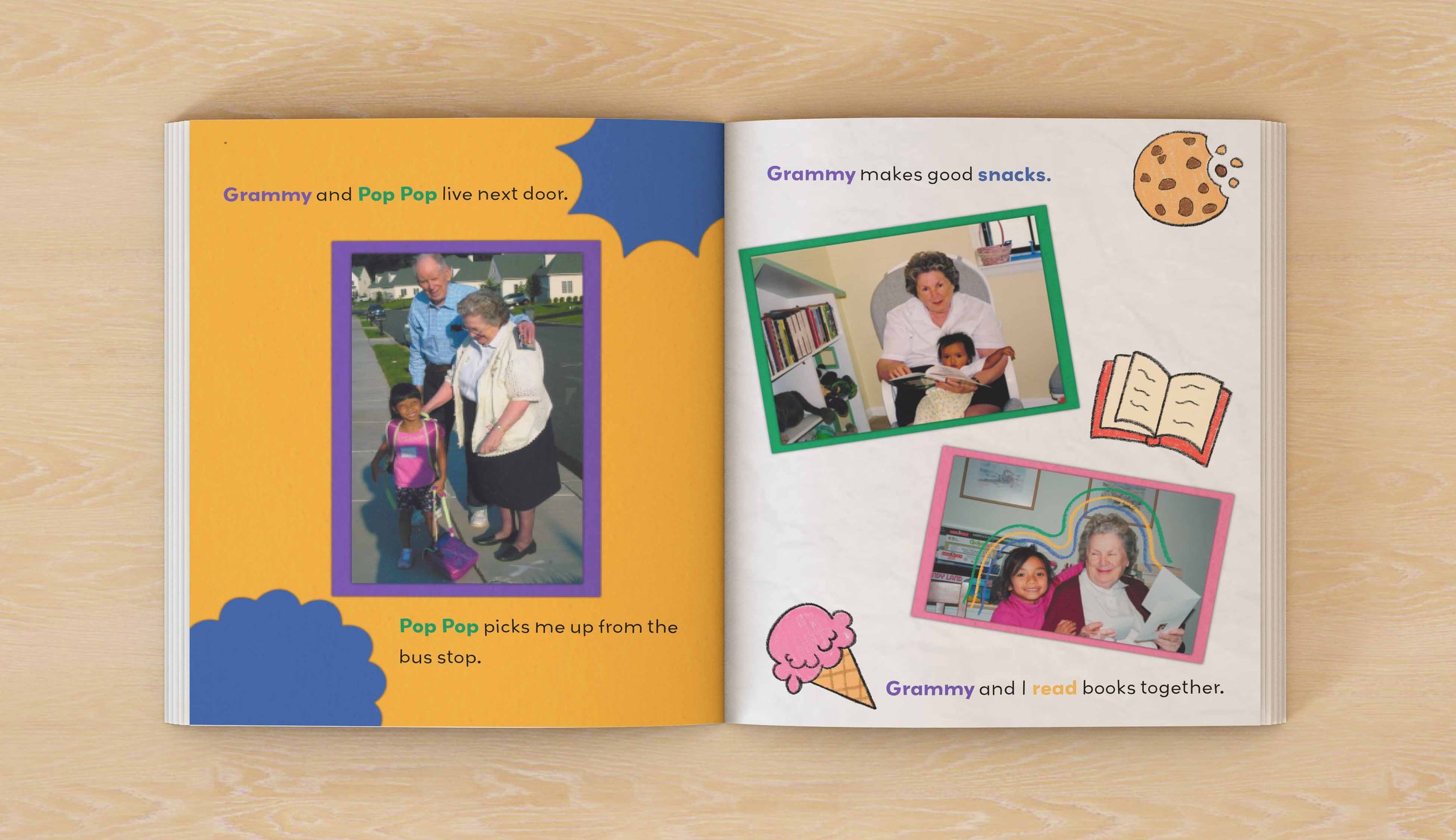
I decided the one page would be in full color and the other side would be white. The colors I chose were very saturated and thought that it would be overpowering if the color was on a full spread. I chose to do one side white to break up the color and it was a good place to put my type. I alternated colors for each spread but also the colored pages and white pages. This helped emphasized the playfulness of the book.
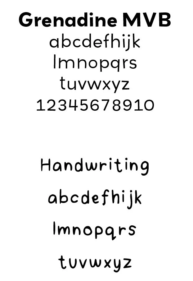
Typefaces: I knew I wanted a playful and whimsical font to reflect the style of my book. I also knew that I wanted a handwritten looking font to fit in with the scrapbook theme. I did keep readability in mind when looking for typefaces. I chose a San serif font that had a playfulness to it for the bodycopy because it was easy to read but still fun. The second typeface I chose was a handwritten font that I just used for callouts. This made it look like I was writing in my own comments but again, still readable.
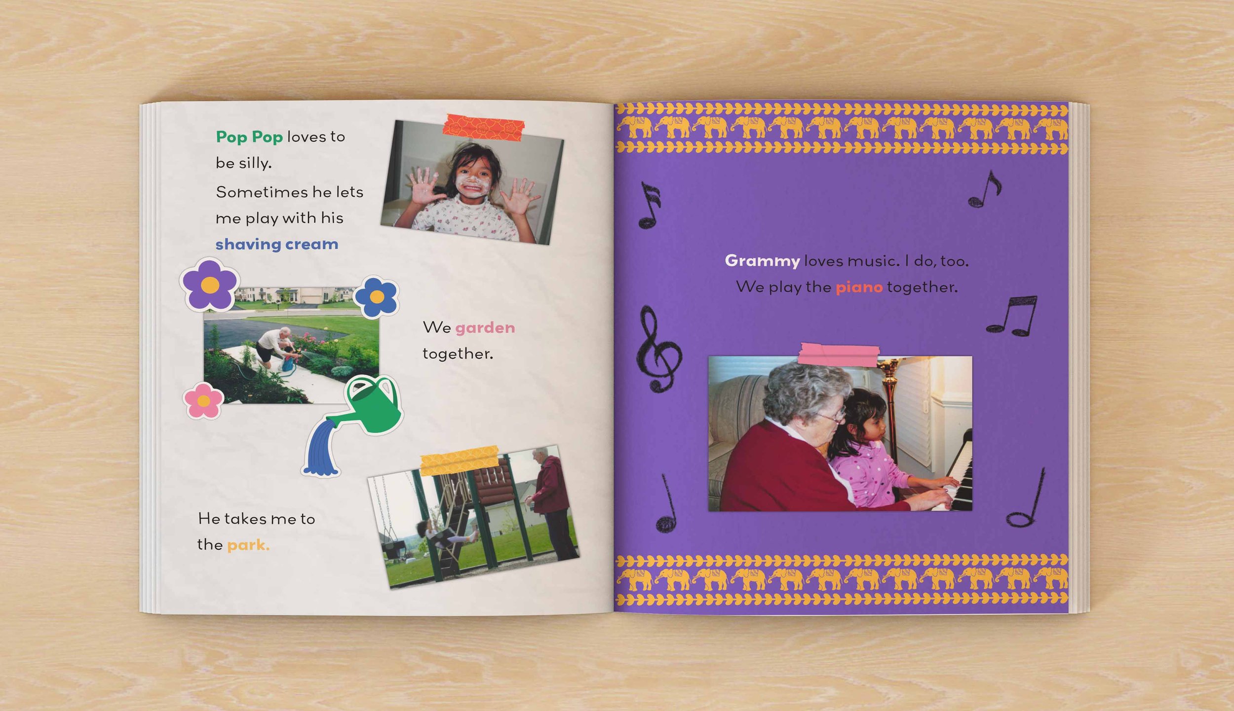
Patterns: I wanted to work in my Cambodian background in a subtle way, so I looked up “Cambodian patterns.” I incorporated the patterns I found in the washi tape that I drew borders for some pages, and blended into the background for some pages as well.


After looking for inspiration I pivoted and went back to my pictures. I started to layout my photos for each spread and made a storyboard. This helped me start to write the book and keep my thoughts organized. I also wanted to get a basic layout so I could start designing my spreads.
I turned to my notes app and just started writing my story without worrying about how many words I was writing. From this point I took what I wrote and started writing page by page and tailored it for my audience.
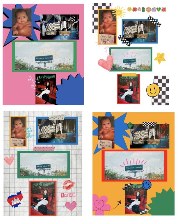
Color palette: To represent Cambodia I knew I wanted to use the colors blue and red because those are the colors in the Cambodian flag. These colors gave me a starting point. I found a blue and red that looked together and started to add in other colors. I chose colors to reflect the playfulness of my book and my own style.

Doodles and Stickers: To add onto the scrapbook aesthetic and children book vibe I wanted to add stickers and doodles around the images of my family. To make the stickers I illustrated an image, put a white outline around it like I got it off sticker pad, and then added a black shape and used a gaussian blur effect to make it look 3D. For the doodles I wanted to have that little kid doodle look at it. Since I was working in procreate, I knew that I could find brushes that resembled crayons, markers, or colored pencils. I chose the colored pencil brush to create the doodles, so it looked more hand done.
Conclusion: Lily the to create a valuable resource that not only entertains but also educates young readers about the beauty of diverse families and the importance of love. The combination of family photos and fun illustrations that bring the narrative to life. This children's book has the potential to make a positive impact on children's perceptions of adoption and family relationships.